

Stories from the Globe


Google Maps has become so integral to modern wayfinding and personal geographies, that most of us don’t bother to question it’s validity. So when Google Maps made the switch from using the Mercator projection to an orthographic projection last year, the deeply political implications of this decision were not well understood. Heck, few people had even heard of map projections at all.
As the earth is a 3-D form, any attempt at representing it in 2-D will inherently cause some distortions in the process. Each projection distorts the earth in different ways, and some projections are better suited to represent geographical objectives (topography, navigation, engineering, weather, etc.). The Mercator projection, invented in the 16th century, is the most widely accepted map projection today, though there are critical flaws in its use as well.
The Mercator projection has been criticized for it’s Euro-centric bias which perpetuates colonialist narratives. As a cylindrical projection, it prioritizes preserving the Earth’s equator, while making the northern hemisphere look larger and more powerful. For example, Greenland appears larger than Africa on a Mercator projection while in reality, Africa is 14 times the size of Greenland. Africa and Europe also appear nearly the same size, though Africa is actually 3 times larger than Europe.
Google’s efforts to portray a more a factual and unbiased representation of the earth are a reminder that all 2 dimensional maps tell are really just stories. These stories are layered with geopolitical interests, and when unpacked, they are powerful- and beautiful- tools that can be used to uncover a moment in time. David Rumsey’s Map Collection is my favourite digital resources for uncovering some of the greatest stories of the globe. The archive is maintained by the Cartography Association and contains nearly 90,000 maps from around the world. The website is definitely worth a browse on your own, but to spark your curiosity, have a look at some highlights below:
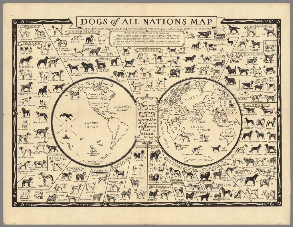
Dogs of All Nations Map (1936). Author: Frantz, E. Click here to view full image.
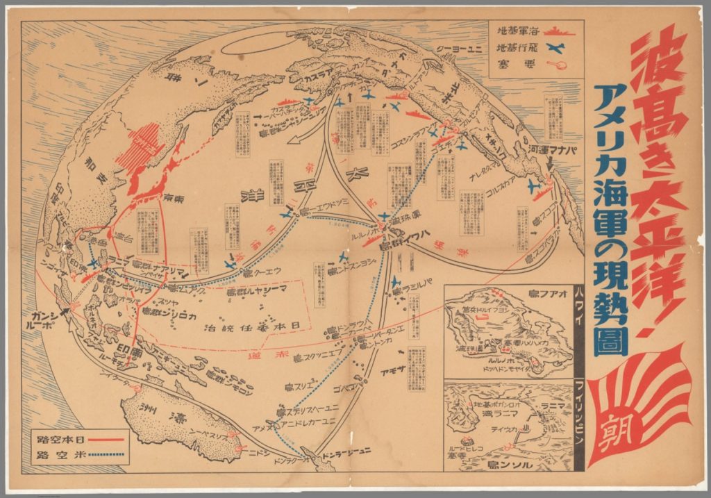
Current status of U.S. Navy in the Pacific Ocean during War II (1942, estimated). Author unknown. Click here to view full image
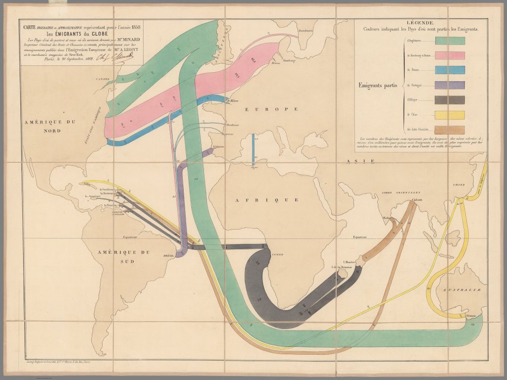
Global emigration routes in 1858. Author: Charles Joseph Minard. Click here to view full image.
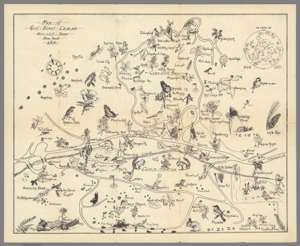
Map of Girl Scout Camps – Briarcliff Manor – New York – U.S.A. (1933). Image by B.C.O. Click here to view full image.
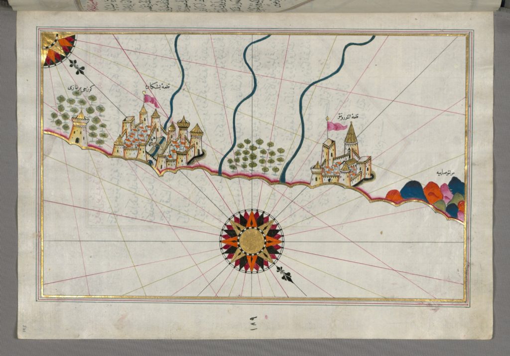
16th century Turkish map of the Italian coastline from Ancona to Pescara. (1525). Author: Raʾīs al-Baḥr Pīrī ibn Muḥammad. Click here to view full image
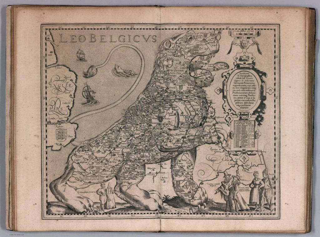
In the 16th and 17th centuries, a lion was commonly used to symbolize the former low countries now known as the Netherlands, Luxembourg, Belgium, and northern France. (1617). Author: Pieter van den Keer. Click here to view full image.
